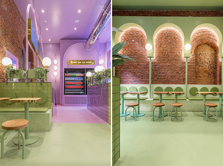
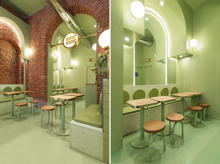
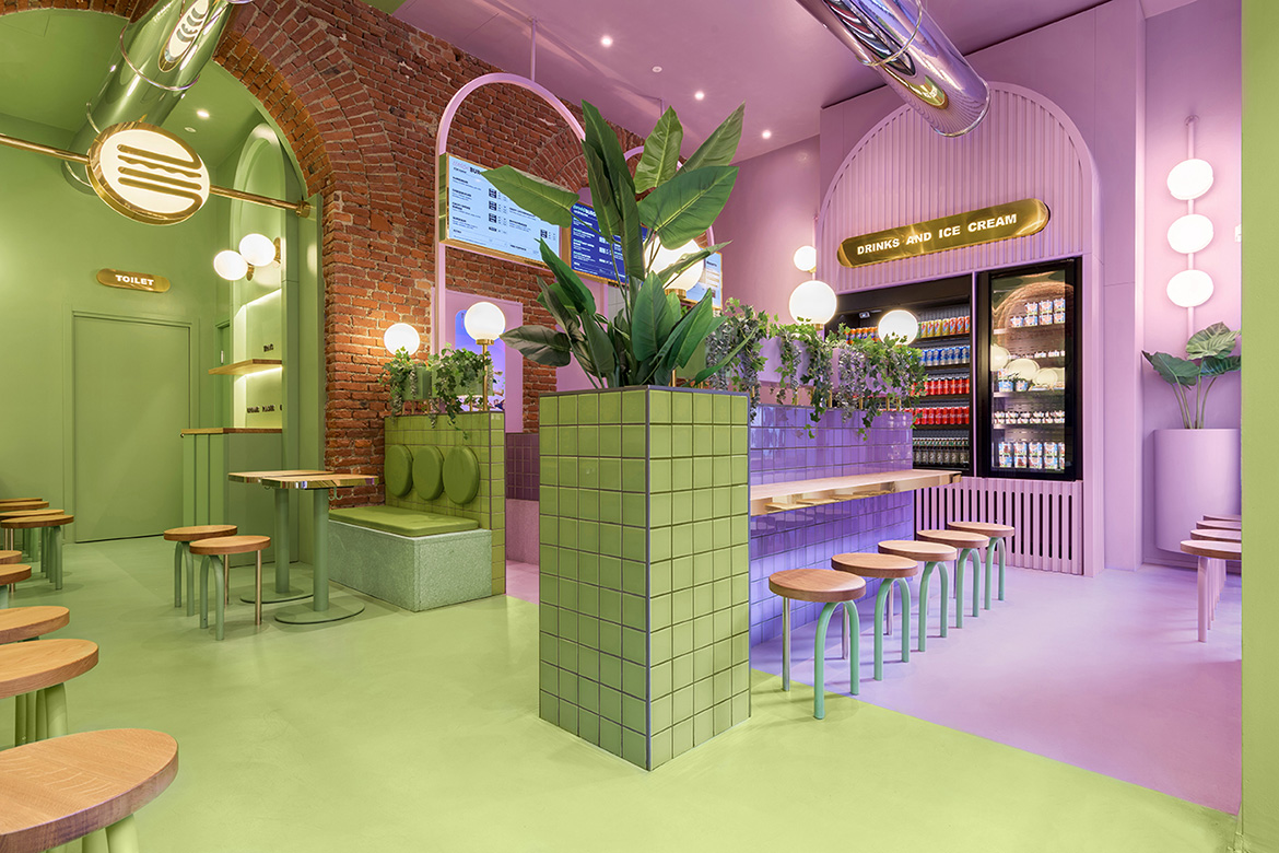
The Valencia-based studio Masquespacio has finished its first interior design project in Milan for the Italian hamburger chain Bun Burgers. The project aimed to create an identity with a clear focus on the younger generations and at the same time represent a more sophisticated approach for a high-quality hamburger restaurant.
During the last years, there is strong growth of hamburger chains, although most of them are opting for vintage & industrial look for their spaces. The design developed by Masquespacio for Bun takes the opposite direction and seeks to create an innovative concept that showcases the authenticity of Bun and its smash burgers. This way Masquespacio has used gold touches and terrazzo tiles mixed with a splash of color that creates a sophisticated but at the same time fresh design.

The project itself although starts from the investigation of the existing elements of the space to integrate them into the overall design aesthetic. Ana Hernández, creative director from Masquespacio: “When we saw the beautiful bricks and arcs from the space it was evident for us that we would use these two elements as the starting point of the design.”
To create a uniform aesthetic through the space Masquespacio added additional arc forms with a green and purple color through the whole space, some totally independent and others are highlighting the already existing arcs from the interior architecture. Additionally, the wooden tabletops and plants represent the healthy and zero plastic identity from Bun.

After their successful collaboration in this project, Masquespacio and Bun are now also working on several new restaurants, amongst which the next one will be Bun’s first opening in Turin.
YEAR: 2021
CLIENT: Bun Burgers
LOCATION: Milan, Italy
PROJECT AREA: 140 sqm (1500 sqft)
DESIGN: Masquespacio


