
Combining psychological theory and design principles, a multidisciplinary team of a typographic designer and behavioral scientists from the Royal Melbourne Institute of Technology (RMIT) has created a font that could confuse you at first glance. The researchers called the new font Sans Forgetica, and this is funny because it is probably the first font specifically designed to help people not to forget what they read.
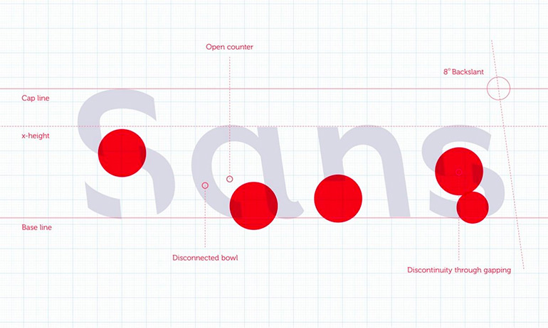
Sans Forgetica is based on a principle of desirable difficulty, which uses minor obstructions in the learning process to promote deeper cognitive processing. The font features two key design elements – an unconventional eight-degree back slant and gaps in each letter – that make it harder to read. As a result, readers have to dwell longer on each word, giving the brain more time to engage in deeper cognitive processing to enhance information retention.
Dr. Janneke Blijlevens, one of the Sans Forgetica project’s researchers, says that typical fonts are not suitable for desirable difficulty because they are very familiar, so readers often glance over them, and no memory trace is created. On the other hand, if a font is too different, the brain can’t process it and the information is not retained. The research showed that Sans Forgetica provided an optimal level of difficulty to read – not too easy, not too difficult – that leads to the highest memory retention. “Sans Forgetica lies at a sweet spot where just enough obstruction has been added to create that memory retention,” said Dr. Janneke Blijlevens.
Roughly 400 Australian university students participated in a laboratory and an online experiment conducted by RMIT’s Behavioural Business Lab. Three new fonts designed according to the principle of desirable difficulty – a font with gaps, a font with gaps and a back slant (Sans Forgetica) and a font with gaps, a back slant, and asymmetry – were tested by asking students to remember pairs of words presented in those fonts.

In the laboratory experiment, 96 participants looked at word pairs. The participants were able to recall more word pairs studied in Sans Forgetica than the word pairs presented in the other two fonts. In the online experiment, 303 students took a mock multiple choice exam. Participants remembered 57 percent of the text when a section was highlighted in Sans Forgetica compared to 50 percent of the surrounding text that was written in a plain Arial.
So if you are interested in better retention of a written text, you can download Sans Forgetica here. It is available as a font and Chrome browser extension, which allows you to convert any on-screen text to Sans Forgetica.
PROJECT TEAM: Stephen Banham, Dr. Jo Peryman, Dr. Janneke Blijlevens
COLLABORATOR: Naked Communications strategy and creative agency